That’s never been more true than today, when companies need to continually evolve to keep pace. Innovative and engaging creative can help businesses through uncertain times. I’ve seen it and been a part of making it happen. When we wanted to grow our subscriptions at TPH, an innovative circular sign-up helped us reach an important goal. Creative work should surprise, enlighten, engage and be authentic in ways that connect with people.
UXDESIGN | AUDIENCE GROWTH
Audience Growth
Project: Increase percentage of organic subscribers to TPH.
Challenge: Unsubscribing was outpacing new subscribers.
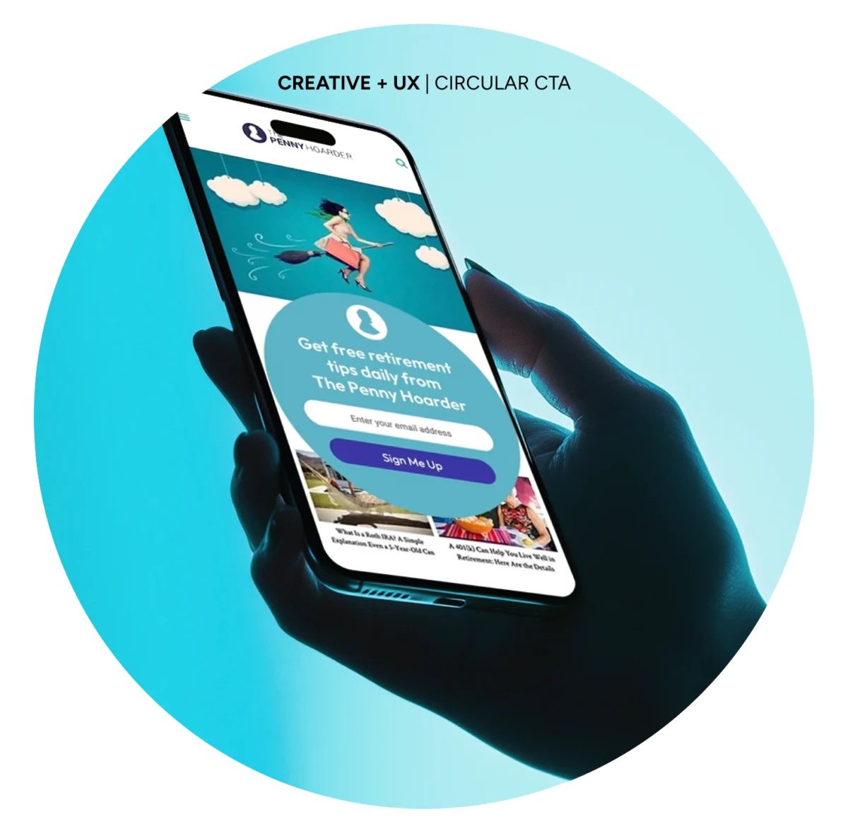
Solution: Redesigned email sign-up widgets and introduced a circular fly-in to inject energy and align with branding.
My Role: Advocated using more circular shapes to reflect the penny’s roundness, creating a stronger brand connection. Designed new sign-up widgets.
Sign-up Increase
+0%
Subscribers
+0M
RESULTS
New email sign-ups through the circular widget increased 245% over the previous design. We grew the subscriber base to 1.4M, from 1M.
CREATIVE DIRECTION
UX DESIGN
FRONTLINE FINANCES
+0%
SUBSCRIBERS
+0%
NEW CONTENT PAGES
▶ PROJECT & GOALS
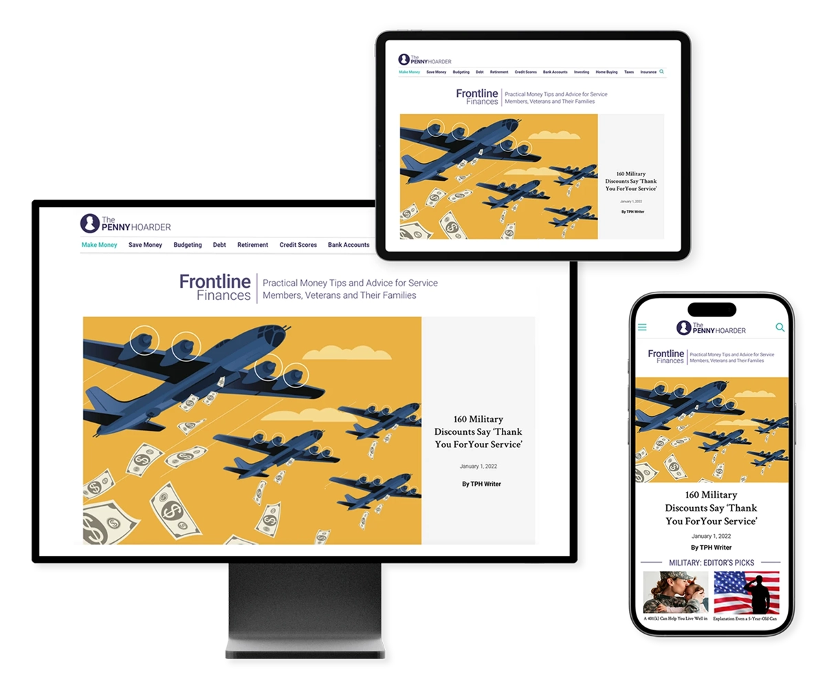
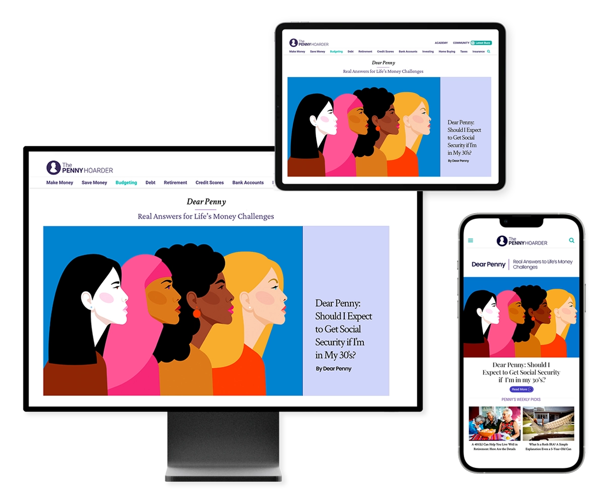
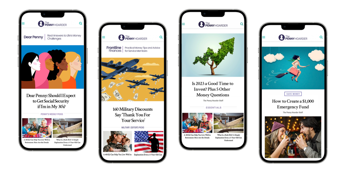
Design new sections for Frontline Finances,Dear Penny and Investing. Enable readers to more easily find similar content, with an increase in number of articles read per visit.
▶ RESULTS
Increases in readership driven by visitors binge-reading multiple columns each visit.
Redesign newsletter sign-ups across the TPH site to increase organic subscribers and grow overall subscriptions past 1M. As part of a branding push, we presented the idea of a circular sign-up for mobile.
▶ RESULTS
The new circular fly-in for mobile delivered over 200% increase in new subscriptions.
The CEO asked for help in increasing click-through and conversions for our largest paid media campaigns. Through the use of authentic images and illustration, we were successful and increased revenue.
▶ RESULTS
Increases in readership driven by visitors binge-reading multiple columns each visit.
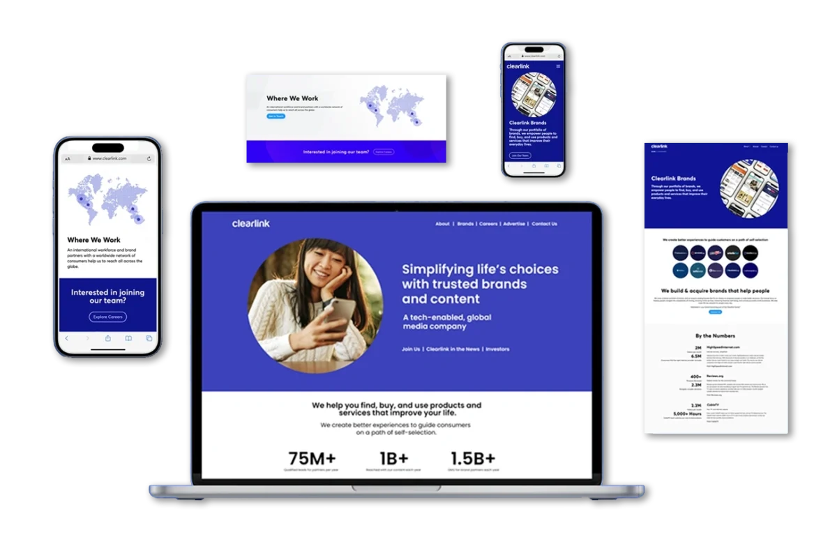
When Clearlink changed ownership, it was important to reflect new messaging and vision. I was asked to turn a redesign at a rapid pace, over a single weekend.
▶ RESULTS
The new circular fly-in for mobile delivered over 200% increase in new subscriptions.
▶ MY ROLE
Initial wireframes and Figma • WordPress • Worked with Developer team to launch site
CREATIVE DIRECTION + UX DESIGN
Clearlink Company Site
▶ PROJECT & GOALS
When Clearlink changed ownership, it was important to reflect new messaging and vision. I was asked to turn a redesign at a rapid pace, over a single weekend.
▶ MY ROLE
Initial wireframes and Figma • WordPress • Worked with Developer team to launch site
New Sign-ups
+ 0%
Subscriptions
+ 0M
UXDESIGN | AUDIENCE GROWTH CASE STUDY
Audience Growth
Project: Increase percentage of organic subscribers to TPH.
Challenge: Unsubscribing was outpacing new subscribers.
Solution: Redesigned email sign-up widgets and introduced a circular fly-in to inject energy and align with branding.
My Role: Advocated using more circular shapes to reflect the penny’s roundness, creating a stronger brand connection. Designed new sign-up widgets.
RESULTS
New email sign-ups through the circular widget increased 245% over the previous design. We grew the subscriber base to 1.4M, from 1M.
Sign-up Increase
+0%
Subscribers
+0M
UX DESIGN& CREATIVE DIRECTION | LANDING PAGES
New Landing Pages
Project: Design new landing pages for two new sections, Dear Penny and military finances.
Challenge: Content in two of our verticals was hard to find and we wanted the journey to be more intuitive for any readers wanting to binge read Dear Penny columns.
My role: UX Design, art direction, creative direction. Development of section name, Frontline Finances.
RESULTS
We saw an immediate increase in Dear Penny columns and our military finance vertical showed good growth numbers.
0m
+0%
IMPRESSIONS
RESULTS
UXDESIGN | AUDIENCE GROWTH CASE STUDY
Audience Growth
Project: Increase percentage of organic subscribers to TPH.
Challenge: Unsubscribing was outpacing new subscribers.
Solution: Redesigned email sign-up widgets and introduced a circular fly-in to inject energy and align with branding.
My Role: Advocated using more circular shapes to reflect the penny’s roundness, creating a stronger brand connection. Designed new sign-up widgets.
RESULTS
New email sign-ups through the circular widget increased 245% over the previous design. We grew the subscriber base to 1.4M, from 1M. We saw increases in engagement and click-through from the daily newsletter.
UXDESIGN
AUDIENCE GROWTH CASE STUDY
Audience Growth
Project: Increase percentage of organic subscribers to TPH.
Challenge: Unsubscribing was outpacing new subscribers.
Solution: Redesigned email sign-up widgets and introduced a circular fly-in to inject energy and align with branding.
My Role: Advocated using more circular shapes to reflect the penny’s roundness, creating a stronger brand connection. Designed new sign-up widgets.
Sign-up Increase
+0%
Subscribers
+0M
RESULTS
New email sign-ups through the circular widget increased 245% over the previous design. We grew the subscriber base to 1.4M, from 1M. We saw increases in engagement and click-through from the daily newsletter.