IMPRESSIONS
CTR
RESULTS
Project: Increase percentage of organic subscribers to TPH.
Challenge: Unsubscribing was outpacing new subscribers.
Solution: Redesigned email sign-up widgets and introduced a circular fly-in to inject energy and align with branding.
My Role: Advocated using more circular shapes to reflect the penny’s roundness, creating a stronger brand connection. Designed new sign-up widgets.
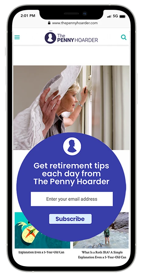
New email sign-ups through the circular widget increased 245% over the previous design. We grew the subscriber base to 1.4M, from 1M.
UX DESIGN | AUDIENCE GROWTH
Growing Audience Through Design
Project & Challenge
Increase percentage of organic subscribers to TPH after discovering a drop in new sign-ups.
Solution
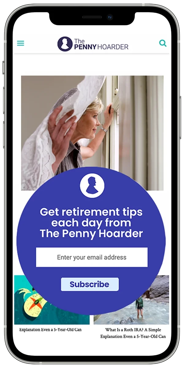
Redesign email sign-up widgets and introduce a circular fly-in to inject energy and align with branding.
My Role
Designed new sign-up widgets across site for improved user experience.
Results
The new circular widget shape drove an increase in sign-ups over 245%.
Meet our success stories


UX DESIGN | NEW VERTICALS
Making the Journey Easier
Project & Challenge
Finding new, targeted content for military members was a challenge.
Solution
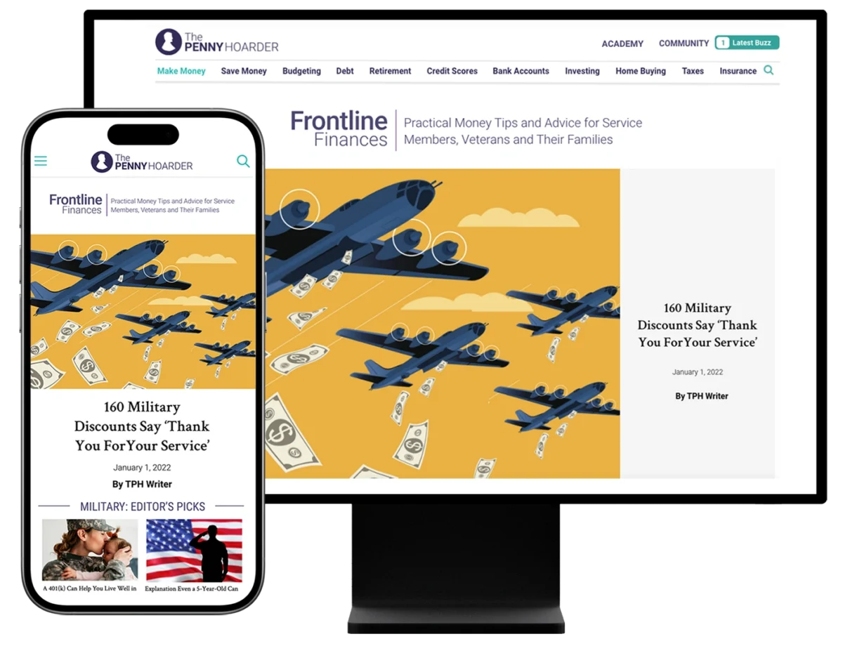
Design a new landing page so readers can find and read multiple military articles and bookmark the page for repeat visits.
My Role
Developed the name "Frontline Finances" and designed the new landing page.
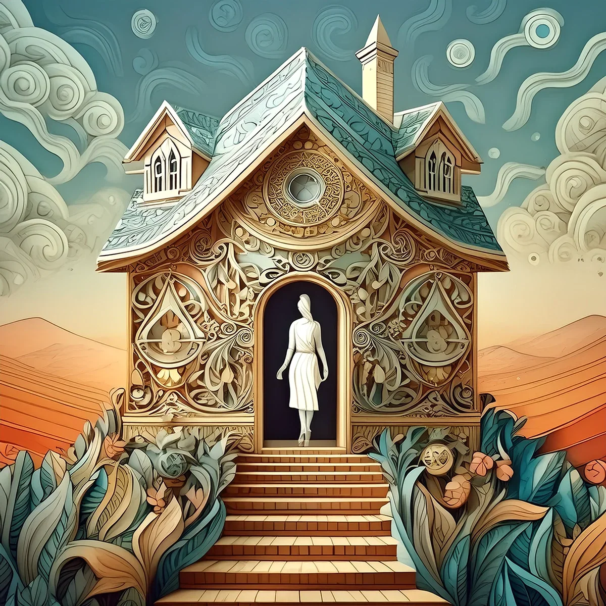
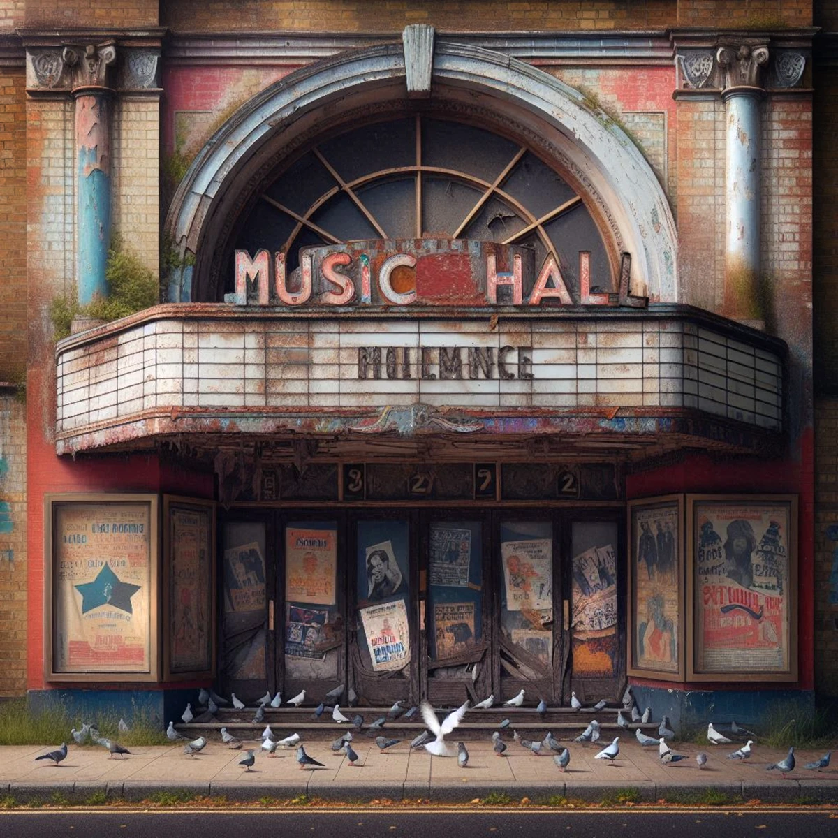
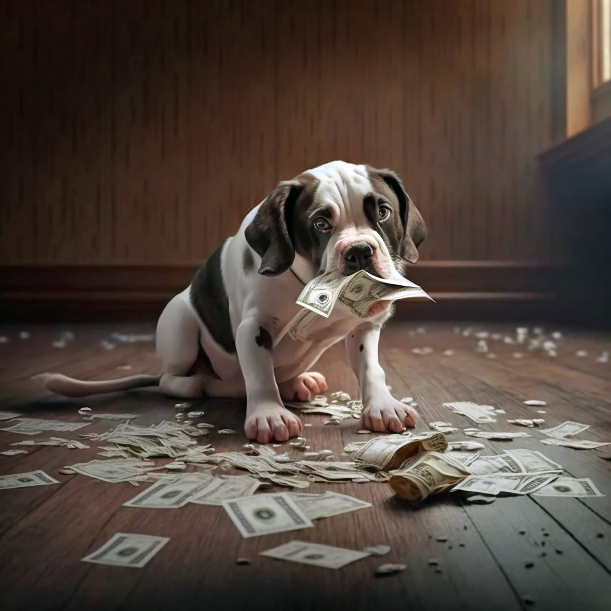
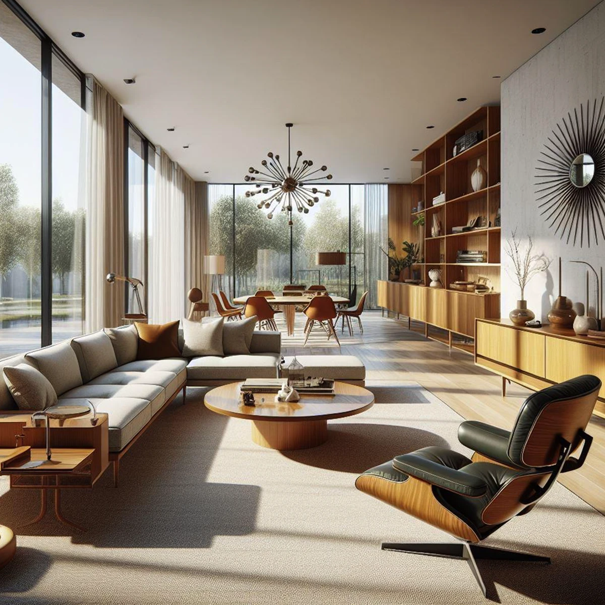
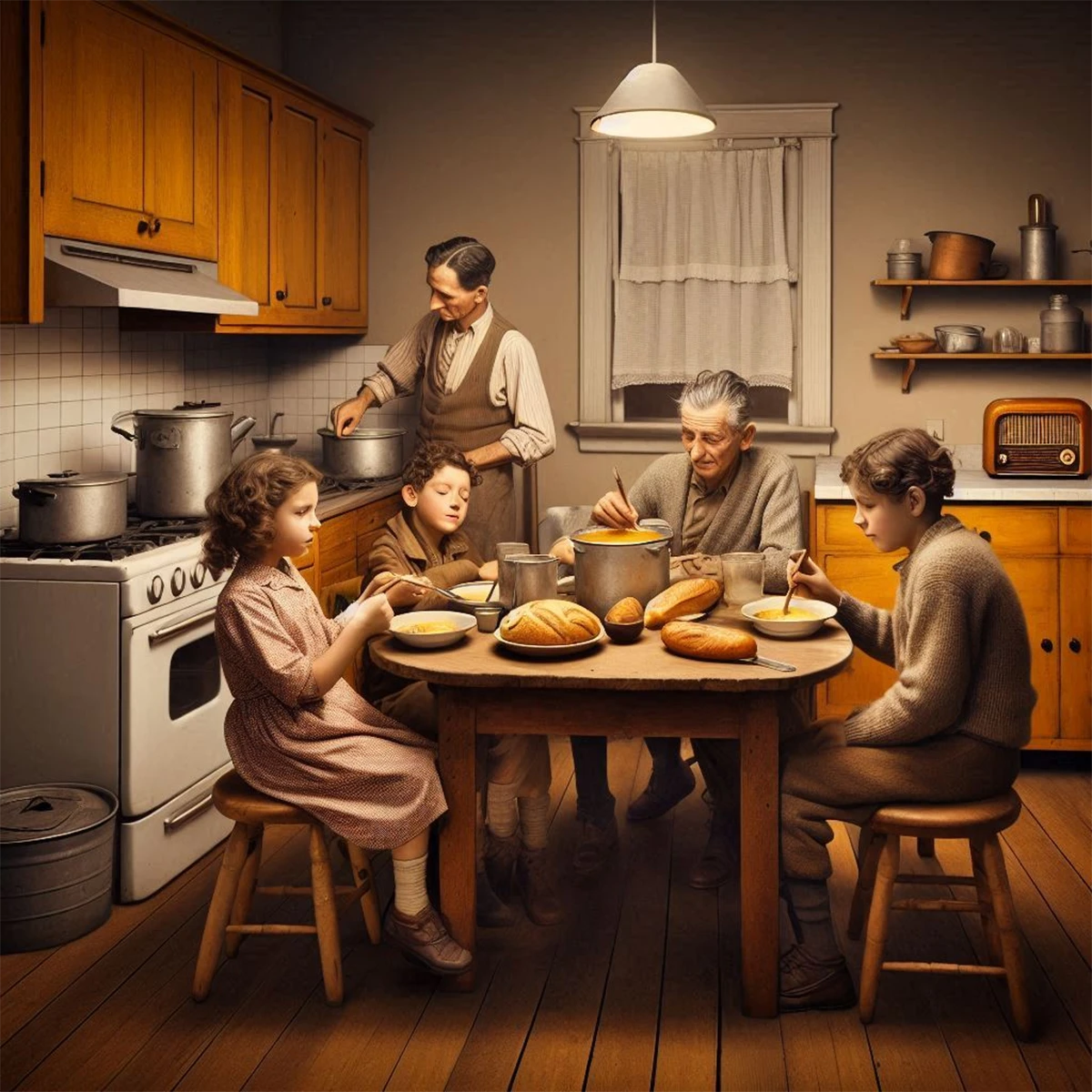
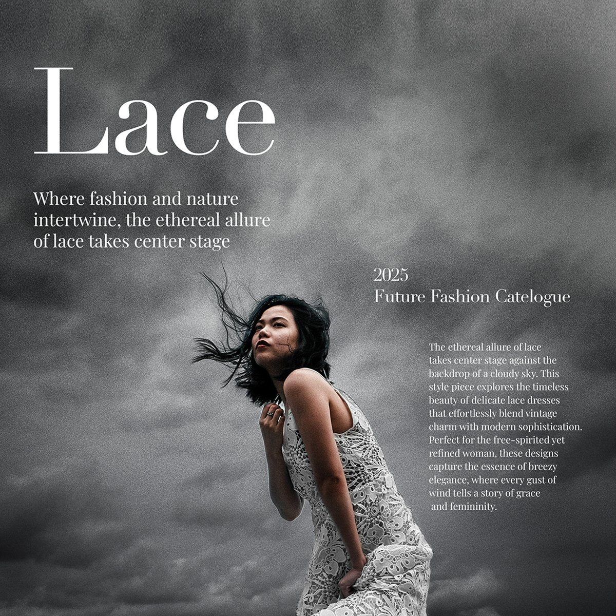
With the arrival of new AI tools for creative work, I tested each of the primary AI creative platforms from Open AI, Adobe and Microsoft Copilot. Creative skills and knowing the best prompting plays a key role in generating better results.




I developed a fashion section prototype for a national magazine as they considered expansion of their print product.
My Role: Image editing, concept and design.
Project: Increase percentage of organic subscribers to TPH.
Challenge: Unsubscribing was outpacing new subscribers.
Solution: Redesigned email sign-up widgets and introduced a circular fly-in to inject energy and align with branding.
My Role: Advocated using more circular shapes to reflect the penny’s roundness, creating a stronger brand connection. Designed new sign-up widgets.
New email sign-ups through the circular widget increased 245% over the previous design. We grew the subscriber base to 1.4M, from 1M.

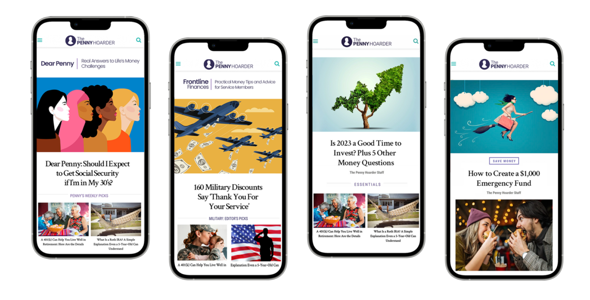
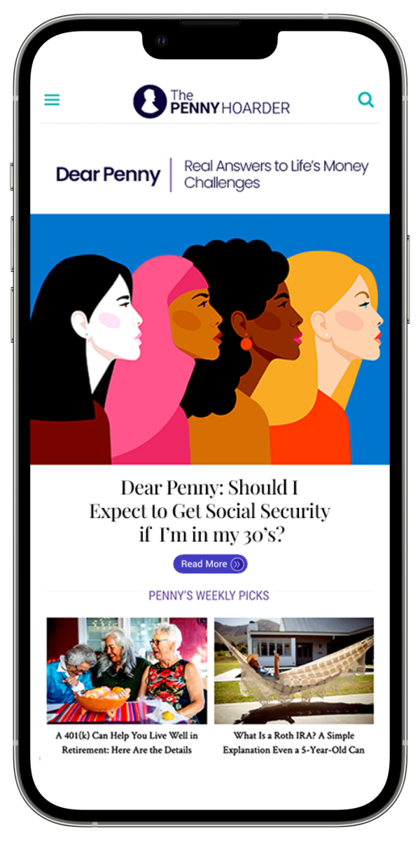
Project: Design new landing pages for two new sections, Dear Penny and military finances.
Challenge: Content in two of our verticals was hard to find and we wanted the journey to be more intuitive for any readers wanting to binge read Dear Penny columns.
My role: UX Design, art direction, creative direction. Development of section name, Frontline Finances.
We saw an immediate increase in Dear Penny columns and our military finance vertical showed good growth numbers.

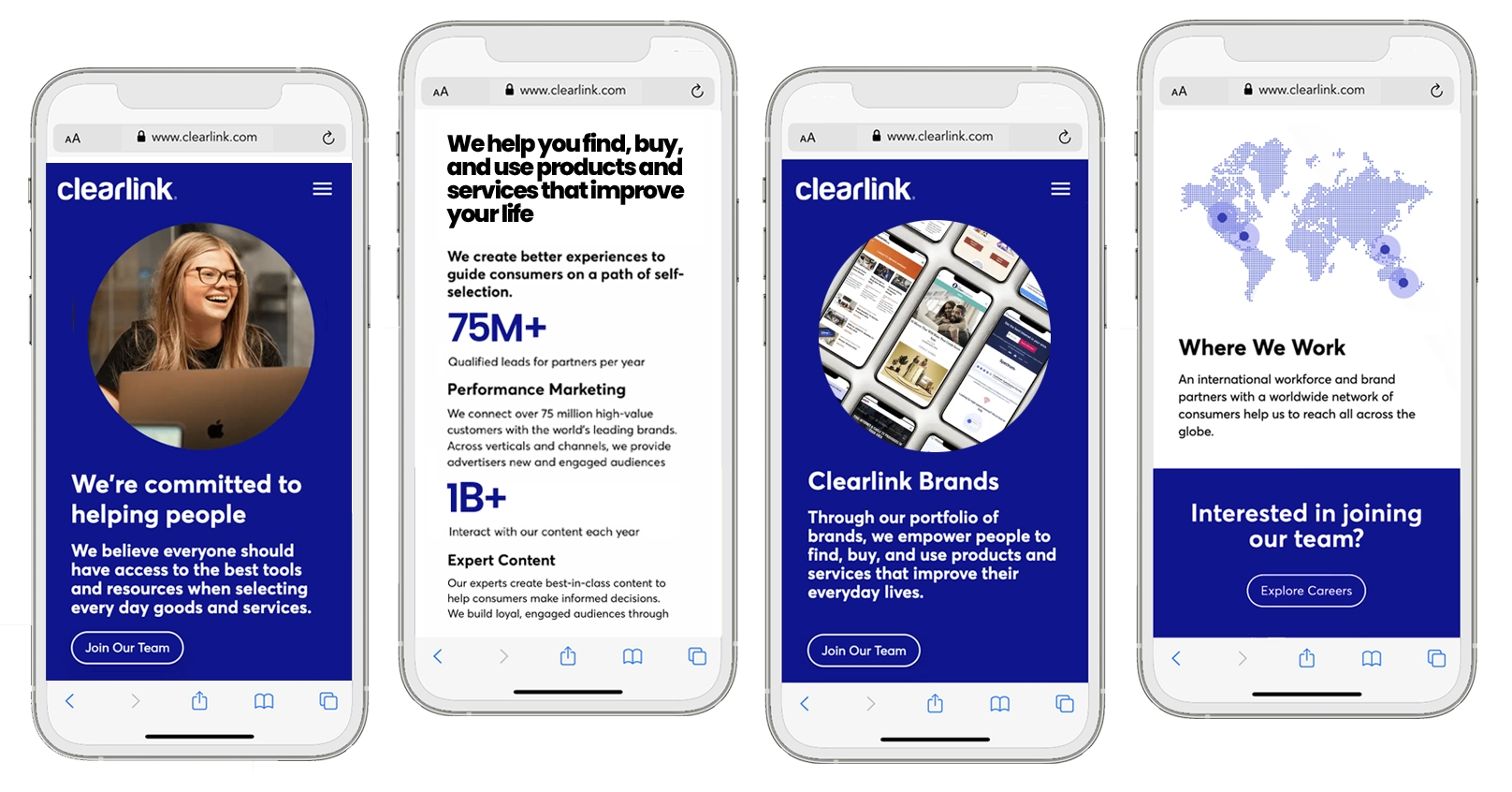
Project: Redesign and site content update to the Clearlink site after an acquisition.
Challenge: Outdated content, mission and culture throughout the site from previous leadership. We felt it important to do a redesign and content update as soon as possible.
My role: The redesign was wireframed and prototyped over a single weekend. The development team completed the launch a few weeks later. UX Design, art direction, creative direction.
Key Changes:
- Image of a real person at the top of the new design.
- We simplified and made larger the hero messaging.
- Key numbers show the success story.

IMPRESSIONS
RESULTS

Project: Increase percentage of organic subscribers to TPH.
Challenge: Unsubscribing was outpacing new subscribers.
Solution: Redesigned email sign-up widgets and introduced a circular fly-in to inject energy and align with branding.
My Role: Advocated using more circular shapes to reflect the penny’s roundness, creating a stronger brand connection. Designed new sign-up widgets.
New email sign-ups through the circular widget increased 245% over the previous design. We grew the subscriber base to 1.4M, from 1M. We saw increases in engagement and click-through from the daily newsletter.
AUDIENCE GROWTH CASE STUDY
Project: Increase percentage of organic subscribers to TPH.
Challenge: Unsubscribing was outpacing new subscribers.
Solution: Redesigned email sign-up widgets and introduced a circular fly-in to inject energy and align with branding.
My Role: Advocated using more circular shapes to reflect the penny’s roundness, creating a stronger brand connection. Designed new sign-up widgets.

New email sign-ups through the circular widget increased 245% over the previous design. We grew the subscriber base to 1.4M, from 1M. We saw increases in engagement and click-through from the daily newsletter.


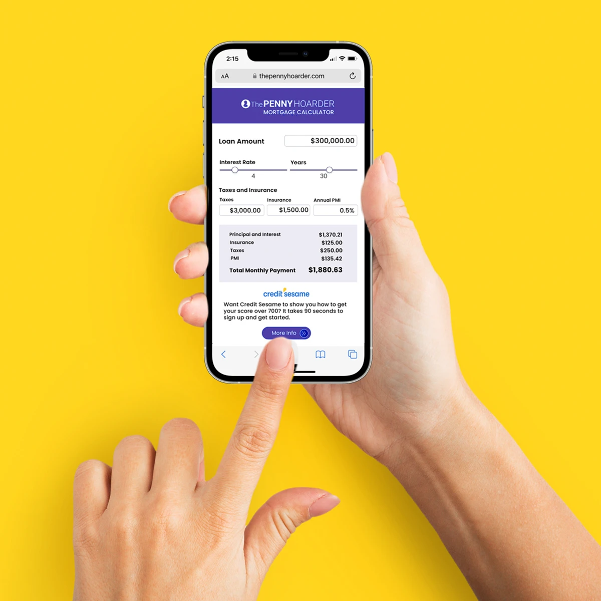
Project: Increase percentage of returning readers to TPH.
Challenge: We needed to provide financial tools readers could come back to use repeatedly.
Solution: Design a mortgage calculator. We also provided an option for sponsorship as a way to increase revenue.
My Role: I designed the mortgage calculator and worked with our development team to launch.
Initial testing showed good engagement for the calculator and excellent click-through to the client site.
I have a genuine passion for midcentury modern homes and furniture. I launched a site where people can learn more about the architecture and furniture of the period.
My role: Site design and build, poster designs, Crate & Barrel prototype designs. Wrote editorial content on the site.
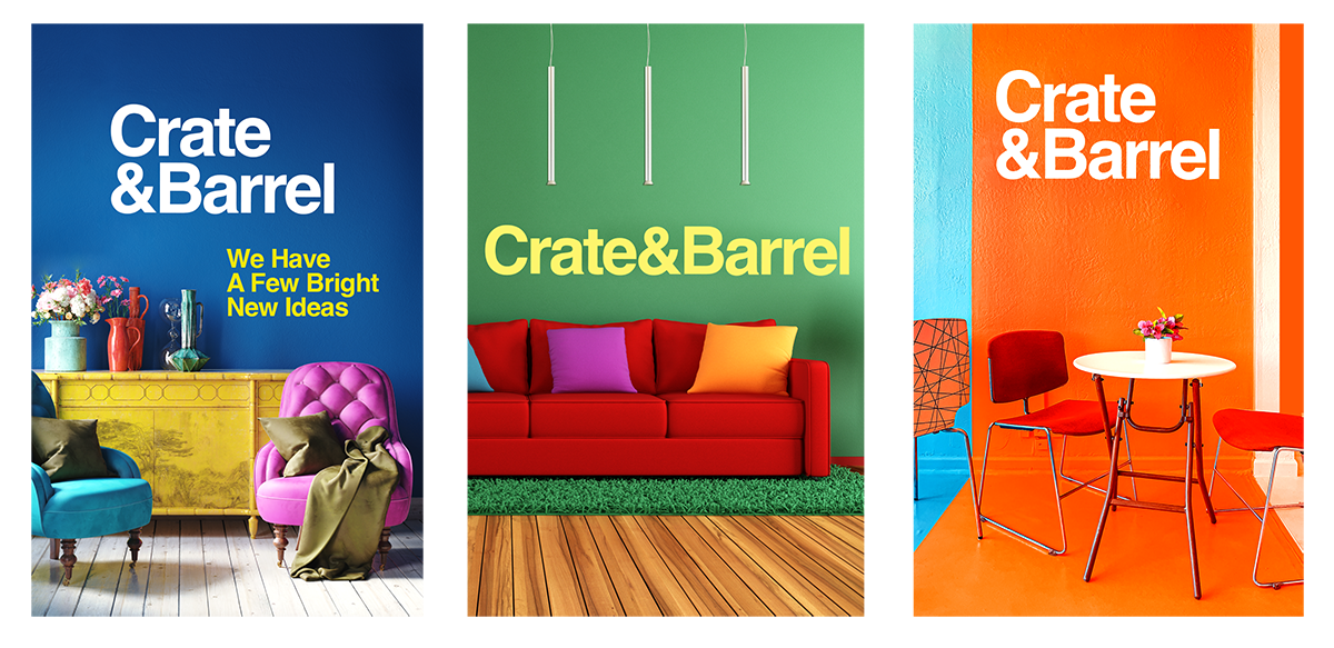
A future prototype introducing a wider color pallette to the fabrics used by Crate & Barrel.
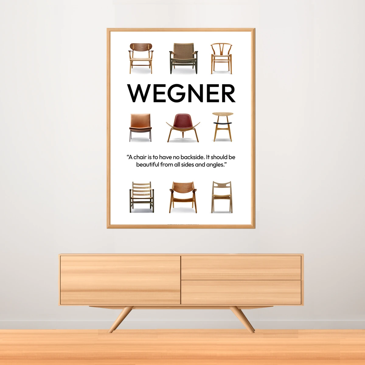


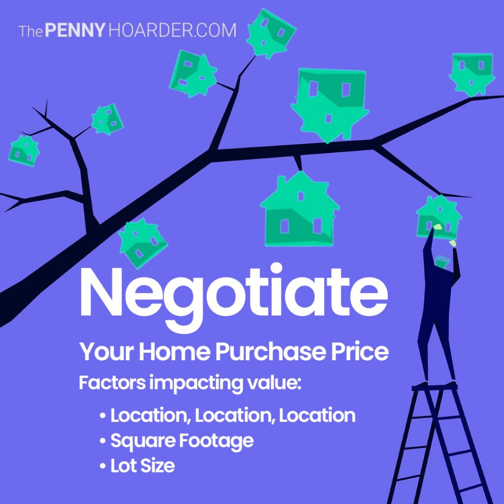

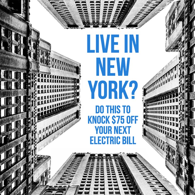
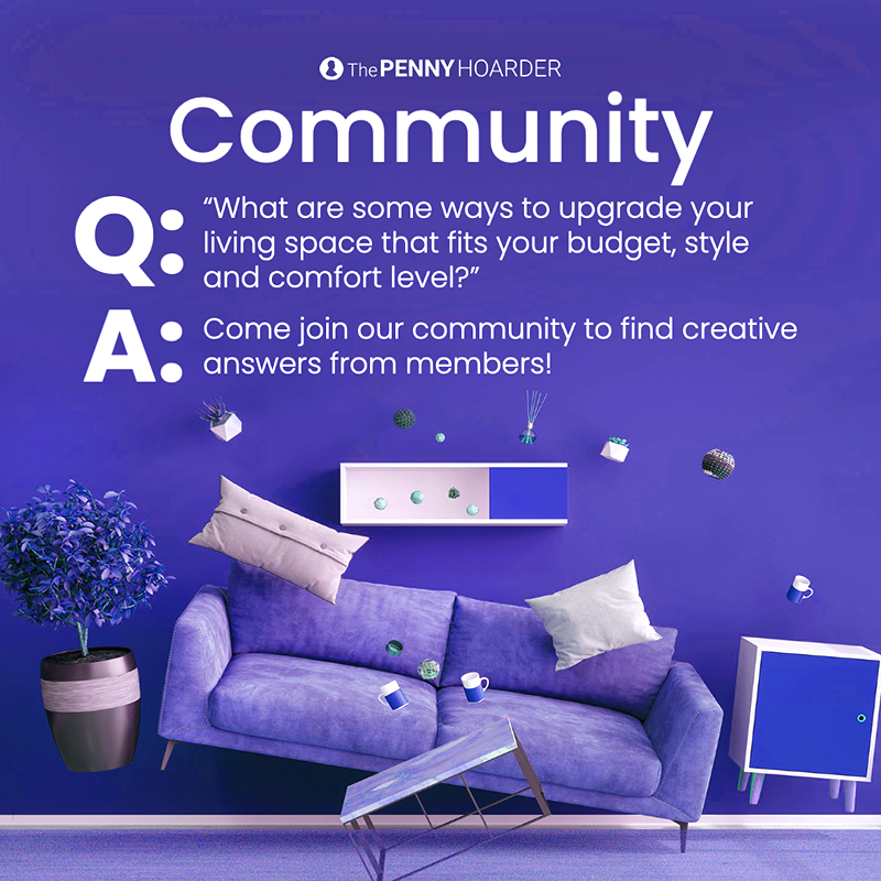
One of the biggest challenges with social is standing out from the crowd. Our team brainstorms and shares ideas daily. We talk through our designs and share open feedback. Our goal is to be something different in the feed but also informative.
My role: I designed each of these, some as part of three month test to improve conversions 15%, which we surpassed at 25%.
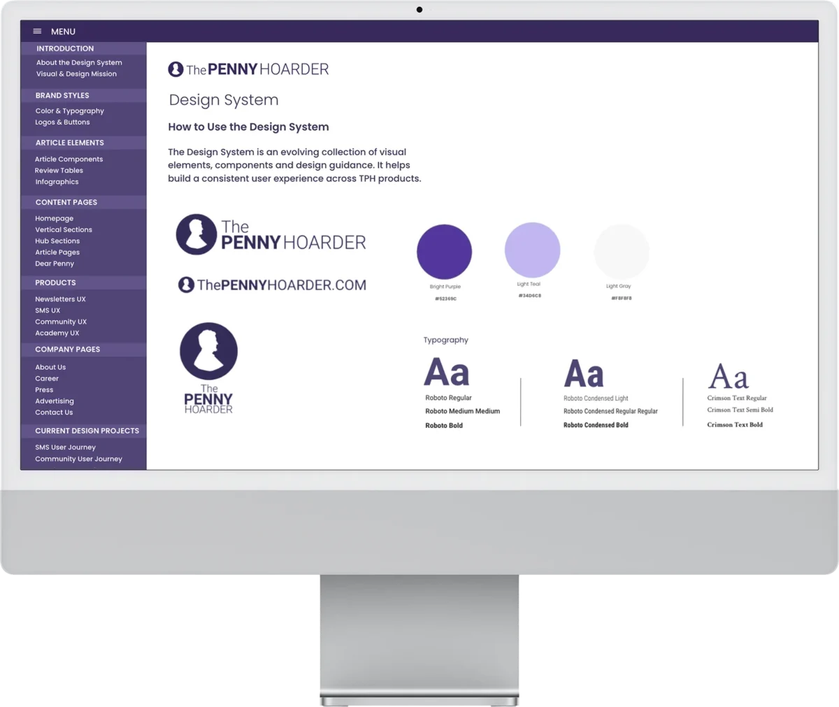
Project: Build an online design system and style guide to help with design consistency
Challenge: When I arrived at TPH, the publication had no style guide or design system. .
My Role: I designed the online design system and style guides.

