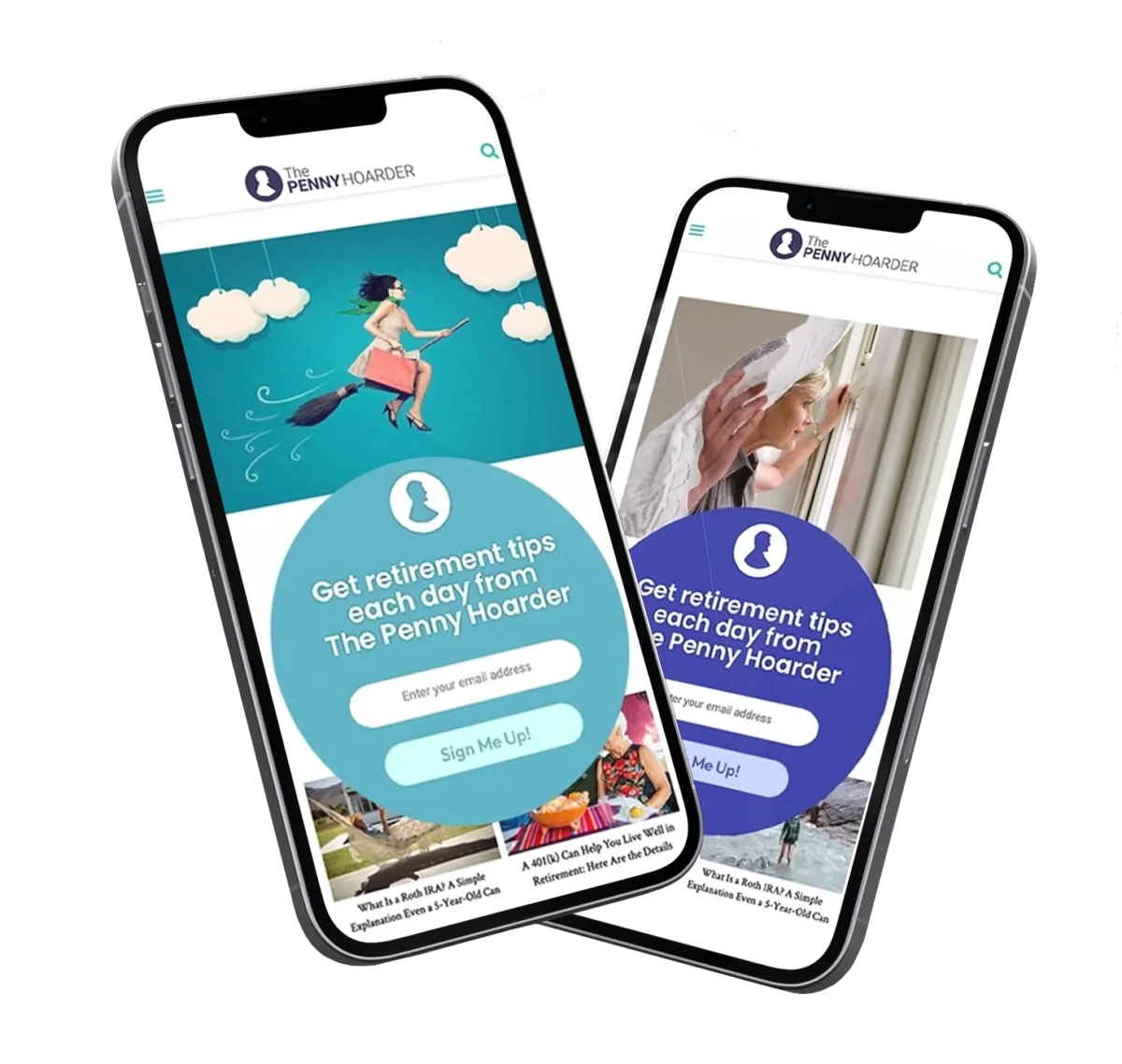
That’s never been more true than today, when companies need to continually evolve to keep pace. Innovative and engaging creative can help businesses through uncertain times. I’ve seen it and been a part of making it happen. When we wanted to grow our subscriptions at TPH, an innovative circular sign-up helped us reach an important goal. Creative work should surprise, enlighten, engage and be authentic in ways that connect with people.
UXDESIGN | AUDIENCE GROWTH
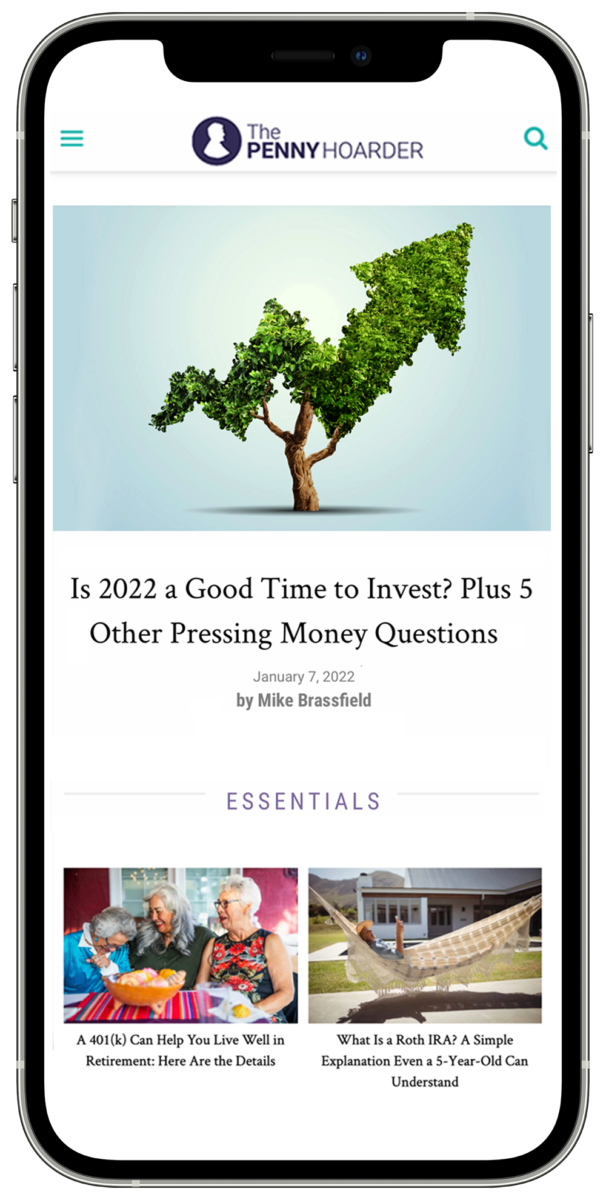
Audience Growth
Project: Increase percentage of organic subscribers to TPH.
Challenge: Unsubscribing was outpacing new subscribers.
Solution: Redesigned email sign-up widgets and introduced a circular fly-in to inject energy and align with branding.
My Role: Advocated using more circular shapes to reflect the penny’s roundness, creating a stronger brand connection. Designed new sign-up widgets.
Sign-up Increase
+0%
Subscribers
+0M
RESULTS
New email sign-ups through the circular widget increased 245% over the previous design. We grew the subscriber base to 1.4M, from 1M.
Creative Direction, UX Design, AI
They say change is constant.
That’s never been more true than today, when companies need to continually evolve to keep pace. Innovative and engaging creative can help businesses through uncertain times. I’ve seen it and been a part of making it happen. When we wanted to grow our subscriptions at TPH, an innovative circular sign-up helped us reach an important goal. Creative work should surprise, enlighten, engage and be authentic in ways that connect with people.
CREATIVE DIRECTION | UX DESIGN
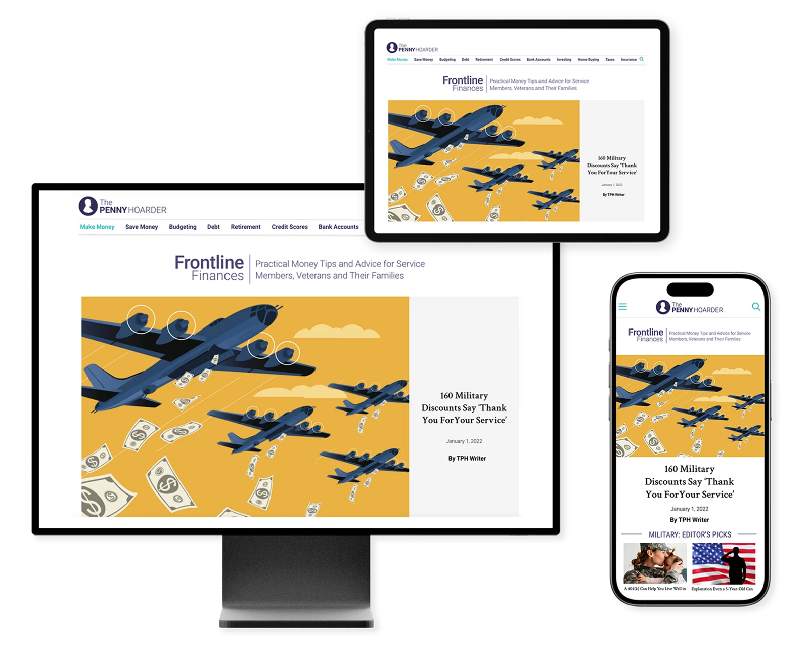
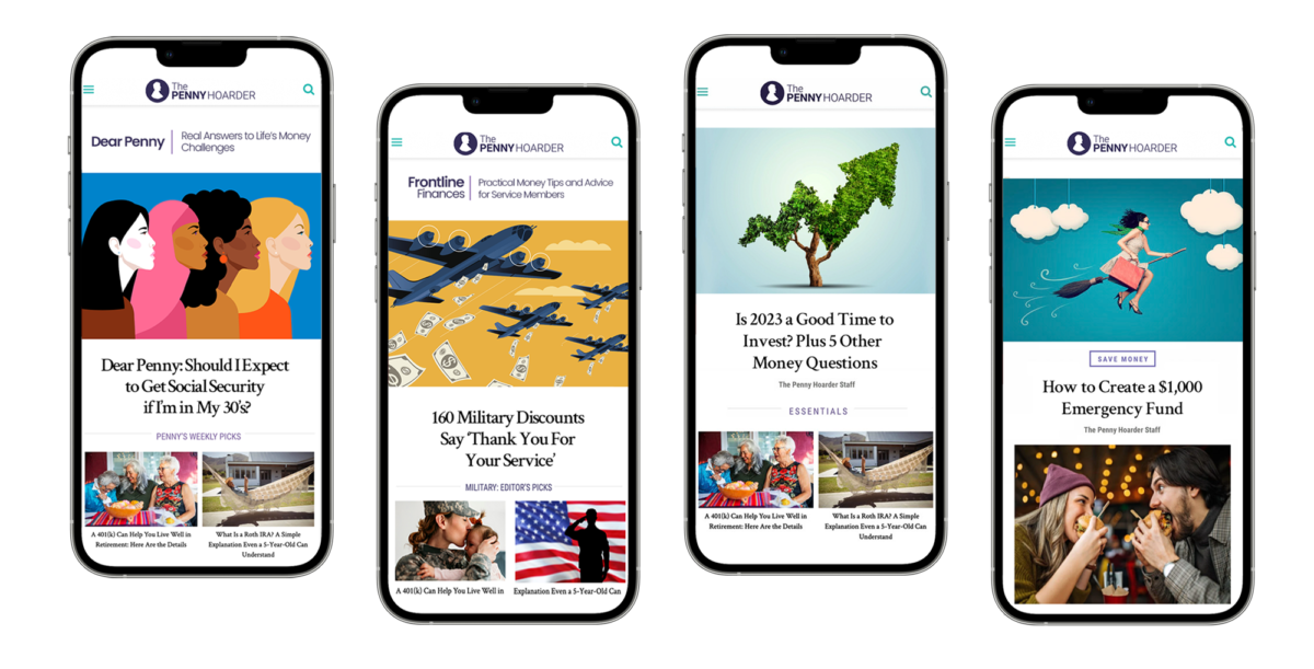
Frontline Finances
Project | Goals: Design a new vertical focused on the unique personal finance challenges for members of the military to make those articles easier to find and read.
My Role: Figma Design, Graphics Editing, WordPress, setup and testing. Name ideation- Frontline Finances
+ 0%
Increase in military financial content.
Buy the book
Lorem ipsum dolor sit amet, consectetur adipiscing elit. Ut elit tellus, luctus nec ullamcorper mattis, pulvinar dapibus leo.
Culpa qui officia deserunt mollit anim id est laborum. Sed ut perspiciatis unde omnis.
Duis aute irure dolor in reprehenderit in voluptate velit esse cillum dolore eu fugiat nulla pariatur. Excepteur sint occaecat cupidatat non proident, sunt in culpa qui officia deserunt mollit anim id est laborum. Sed ut perspiciatis unde omnis iste natus error sit voluptatem accusantium doloremque laudantium.
Victor Hanse comes with his most deeply personal ipsum dolor sit amet, consectetur adipiscing elit. Ut elit tellus, luctus nec ullamcorper mattis, pulvinar dapibus leo. Mauris in erat justo.
Kristine Cox @ Premium e-Books
Rated 5 out of 5
You'll also love
Lorem ipsum dolor sit amet, consectetur adipiscing elit. Ut elit tellus, luctus nec ullamcorper mattis, pulvinar dapibus leo.
Lines from poems
Victor Hansen
Lorem ipsum dolor sit amet, consectetur adipiscing elit. Ut elit tellus, luctus nec ullamcorper mattis leo…
Project | Goals: The TPH CEO asked for my help in increasing click-through and conversions for our largest paid media campaigns. Through the use of authentic images and illustration, we were successful and increased revenue.
My Role: Design, image editing, illustration editing, tracking, testing.
Project | Goals: Design a new vertical focused on the unique personal finance challenges for members of the military to make those articles easier to find and read.
My Role: Figma Design, Graphics Editing, WordPress, setup and testing. Name ideation- Frontline Finances
Project | Goals: When Clearlink changed ownership, it was important to reflect new messaging and vision. I was asked to turn a redesign at a rapid pace, over a single weekend.
My Role: I created initial wireframes and after the overall approach was approved, I created Figma designs. I later worked closely with the development team on implementation.
0m
IMPRESSIONS
+0%
CTR
+0%
RESULTS
Creative Direction, UX Design, AI & Editorial
They say change is constant.
That’s never been more true than today, when companies need to continually evolve to keep pace. Innovative and engaging creative can help businesses through uncertain times. I’ve seen it and been a part of making it happen. When we wanted to grow our subscriptions at TPH, an innovative circular sign-up helped us reach an important goal. Creative work should surprise, enlighten, engage and be authentic in ways that connect with people.
UXDESIGN | AUDIENCE GROWTH
Audience Growth
Project: Increase percentage of organic subscribers to TPH.
Challenge: Unsubscribing was outpacing new subscribers.
Solution: Redesigned email sign-up widgets and introduced a circular fly-in to inject energy and align with branding.
My Role: Advocated using more circular shapes to reflect the penny’s roundness, creating a stronger brand connection. Designed new sign-up widgets.
Sign-up Increase
+0%
Subscribers
+0M
RESULTS
New email sign-ups through the circular widget increased 245% over the previous design. We grew the subscriber base to 1.4M, from 1M.
Creative Direction, UX Design, AI
They say change is constant.
That’s never been more true than today, when companies need to continually evolve to keep pace. Innovative and engaging creative can help businesses through uncertain times. I’ve seen it and been a part of making it happen. When we wanted to grow our subscriptions at TPH, an innovative circular sign-up helped us reach an important goal. Creative work should surprise, enlighten, engage and be authentic in ways that connect with people.
CREATIVE DIRECTION | UX DESIGN
Frontline Finances
Project | Goals: Design a new vertical focused on the unique personal finance challenges for members of the military to make those articles easier to find and read.
My Role: Figma Design, Graphics Editing, WordPress, setup and testing. Name ideation- Frontline Finances
+ 0%
Increase in military financial content.
Buy the book
Lorem ipsum dolor sit amet, consectetur adipiscing elit. Ut elit tellus, luctus nec ullamcorper mattis, pulvinar dapibus leo.
Culpa qui officia deserunt mollit anim id est laborum. Sed ut perspiciatis unde omnis.
Duis aute irure dolor in reprehenderit in voluptate velit esse cillum dolore eu fugiat nulla pariatur. Excepteur sint occaecat cupidatat non proident, sunt in culpa qui officia deserunt mollit anim id est laborum. Sed ut perspiciatis unde omnis iste natus error sit voluptatem accusantium doloremque laudantium.
Victor Hanse comes with his most deeply personal ipsum dolor sit amet, consectetur adipiscing elit. Ut elit tellus, luctus nec ullamcorper mattis, pulvinar dapibus leo. Mauris in erat justo.
Kristine Cox @ Premium e-Books
Rated 5 out of 5
You'll also love
Lorem ipsum dolor sit amet, consectetur adipiscing elit. Ut elit tellus, luctus nec ullamcorper mattis, pulvinar dapibus leo.
Lines from poems
Victor Hansen
Lorem ipsum dolor sit amet, consectetur adipiscing elit. Ut elit tellus, luctus nec ullamcorper mattis leo…
Project | Goals: The TPH CEO asked for my help in increasing click-through and conversions for our largest paid media campaigns. Through the use of authentic images and illustration, we were successful and increased revenue.
My Role: Design, image editing, illustration editing, tracking, testing.
Project | Goals: Design a new vertical focused on the unique personal finance challenges for members of the military to make those articles easier to find and read.
My Role: Figma Design, Graphics Editing, WordPress, setup and testing. Name ideation- Frontline Finances
Project | Goals: When Clearlink changed ownership, it was important to reflect new messaging and vision. I was asked to turn a redesign at a rapid pace, over a single weekend.
My Role: I created initial wireframes and after the overall approach was approved, I created Figma designs. I later worked closely with the development team on implementation.
UXDESIGN | AUDIENCE GROWTH CASE STUDY
Audience Growth
Project: Increase percentage of organic subscribers to TPH.
Challenge: Unsubscribing was outpacing new subscribers.
Solution: Redesigned email sign-up widgets and introduced a circular fly-in to inject energy and align with branding.
My Role: Advocated using more circular shapes to reflect the penny’s roundness, creating a stronger brand connection. Designed new sign-up widgets.
RESULTS
New email sign-ups through the circular widget increased 245% over the previous design. We grew the subscriber base to 1.4M, from 1M.
Sign-up Increase
+0%
Subscribers
+0M
UX DESIGN& CREATIVE DIRECTION | LANDING PAGES
New Landing Pages
Project: Design new landing pages for two new sections, Dear Penny and military finances.
Challenge: Content in two of our verticals was hard to find and we wanted the journey to be more intuitive for any readers wanting to binge read Dear Penny columns.
My role: UX Design, art direction, creative direction. Development of section name, Frontline Finances.
RESULTS
We saw an immediate increase in Dear Penny columns and our military finance vertical showed good growth numbers.
0m
+0%
IMPRESSIONS
RESULTS
UXDESIGN | AUDIENCE GROWTH CASE STUDY
Audience Growth
Project: Increase percentage of organic subscribers to TPH.
Challenge: Unsubscribing was outpacing new subscribers.
Solution: Redesigned email sign-up widgets and introduced a circular fly-in to inject energy and align with branding.
My Role: Advocated using more circular shapes to reflect the penny’s roundness, creating a stronger brand connection. Designed new sign-up widgets.
RESULTS
New email sign-ups through the circular widget increased 245% over the previous design. We grew the subscriber base to 1.4M, from 1M. We saw increases in engagement and click-through from the daily newsletter.
UXDESIGN
AUDIENCE GROWTH CASE STUDY
Audience Growth
Project: Increase percentage of organic subscribers to TPH.
Challenge: Unsubscribing was outpacing new subscribers.
Solution: Redesigned email sign-up widgets and introduced a circular fly-in to inject energy and align with branding.
My Role: Advocated using more circular shapes to reflect the penny’s roundness, creating a stronger brand connection. Designed new sign-up widgets.
Sign-up Increase
+0%
Subscribers
+0M
RESULTS
New email sign-ups through the circular widget increased 245% over the previous design. We grew the subscriber base to 1.4M, from 1M. We saw increases in engagement and click-through from the daily newsletter.
UXDESIGN | AUDIENCE GROWTH CASE STUDY
Audience Growth
Project: Increase percentage of organic subscribers to TPH.
Challenge: Unsubscribing was outpacing new subscribers.
Solution: Redesigned email sign-up widgets and introduced a circular fly-in to inject energy and align with branding.
My Role: Advocated using more circular shapes to reflect the penny’s roundness, creating a stronger brand connection. Designed new sign-up widgets.
RESULTS
New email sign-ups through the circular widget increased 245% over the previous design. We grew the subscriber base to 1.4M, from 1M.
Sign-up Increase
+0%
Subscribers
+0M
UX DESIGN& CREATIVE DIRECTION | LANDING PAGES
New Landing Pages
Project: Design new landing pages for two new sections, Dear Penny and military finances.
Challenge: Content in two of our verticals was hard to find and we wanted the journey to be more intuitive for any readers wanting to binge read Dear Penny columns.
My role: UX Design, art direction, creative direction. Development of section name, Frontline Finances.
RESULTS
We saw an immediate increase in Dear Penny columns and our military finance vertical showed good growth numbers.
0m
+0%
IMPRESSIONS
RESULTS
UXDESIGN | AUDIENCE GROWTH CASE STUDY
Audience Growth
Project: Increase percentage of organic subscribers to TPH.
Challenge: Unsubscribing was outpacing new subscribers.
Solution: Redesigned email sign-up widgets and introduced a circular fly-in to inject energy and align with branding.
My Role: Advocated using more circular shapes to reflect the penny’s roundness, creating a stronger brand connection. Designed new sign-up widgets.
RESULTS
New email sign-ups through the circular widget increased 245% over the previous design. We grew the subscriber base to 1.4M, from 1M. We saw increases in engagement and click-through from the daily newsletter.
UXDESIGN
AUDIENCE GROWTH CASE STUDY
Audience Growth
Project: Increase percentage of organic subscribers to TPH.
Challenge: Unsubscribing was outpacing new subscribers.
Solution: Redesigned email sign-up widgets and introduced a circular fly-in to inject energy and align with branding.
My Role: Advocated using more circular shapes to reflect the penny’s roundness, creating a stronger brand connection. Designed new sign-up widgets.
Sign-up Increase
+0%
Subscribers
+0M
RESULTS
New email sign-ups through the circular widget increased 245% over the previous design. We grew the subscriber base to 1.4M, from 1M. We saw increases in engagement and click-through from the daily newsletter.